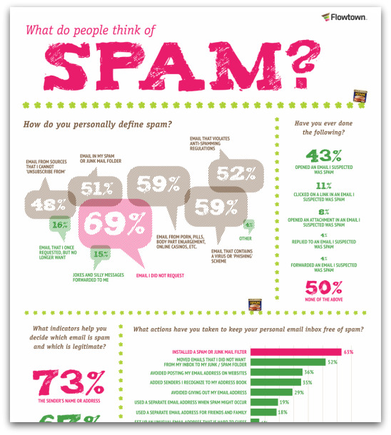
The folks at Flowtown put together this awesome infographic detailing a variety of stats around people’s perceptions of spam. Click on the image to view the full-sized version.
The data for the infographic comes from the: Ipsos Public Affairs 2010 MAAWG (Messaging Anti-Abuse Working Group ) E-Mail Security Awareness and Usage Report.
You can access a summary of the surey report data used in here. [pdf]
Source: Flowtown
