infographic
The Noob Guide To Online Marketing [Infographic]
The folks at Unbounce designed this awesome infographic, a detailed visual guide to online marketing that explains how to promote a website or a service using 8 different methods, like Content Marketing, Pay-Per-Click and Email Marketing.
Click on the image to enlarge (it’s huge!)
via Unbounce…
The Anatomy of a Perfect Website [Infographic]
Did you know there are over 525,998,433 websites out there?
How many sites do you think lack some of the basic optimization techniques, like valid CSS and HTML?
In this brilliant infographic produced by ROI Media you find lots of hints and tips on how a perfect website should be designed.
Click image to enlarge.…
Things That Happen Every 60 Seconds On The Internet [Infographic]
Did you know that, every 60 seconds, there are over 695,000 status updates on Facebook, 19,000 PayPal payments, over 12,000 new Craigslist ads and 98,000+ tweets?
Check out some interesting facts about websites that we use every day.
Infographics offered by Shanghai Web Designers
…
Have Our Email Viewing Habits Changed? [Infographic]
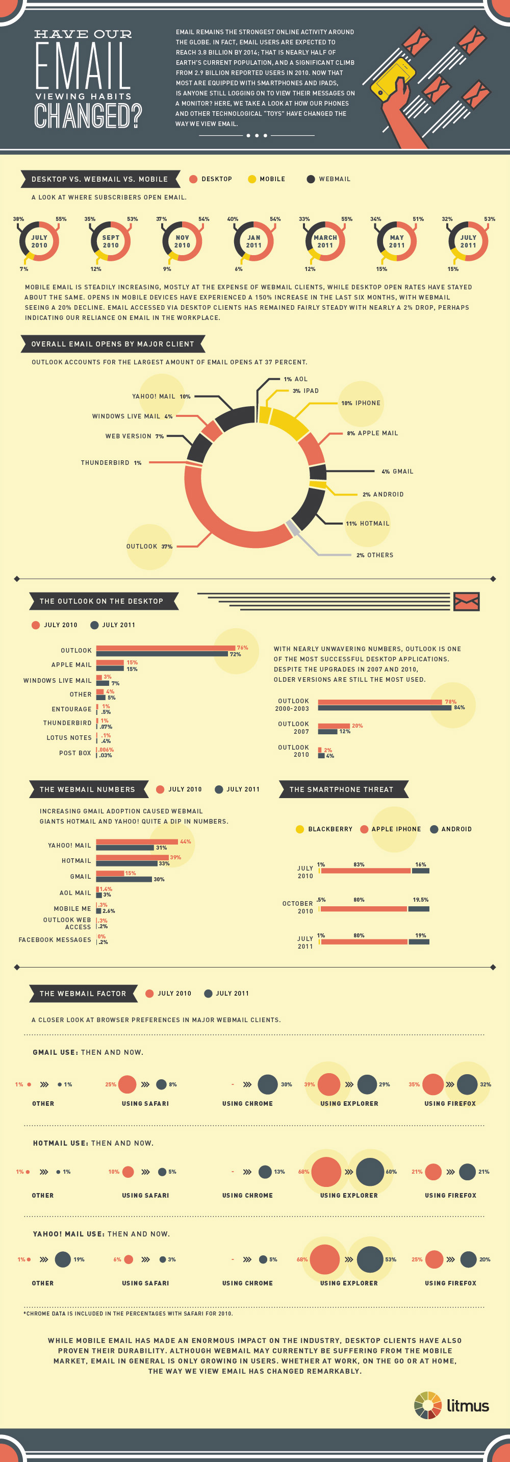
According to Litmus, email users are expected to reach 3.8 billion by 2014. But the way we view email has changed ramarkably.
Check out this informative infographic on how our email viewing habits have been changed.
Click image to enlarge infographic…
What Annoys People About Emails [Infographic]
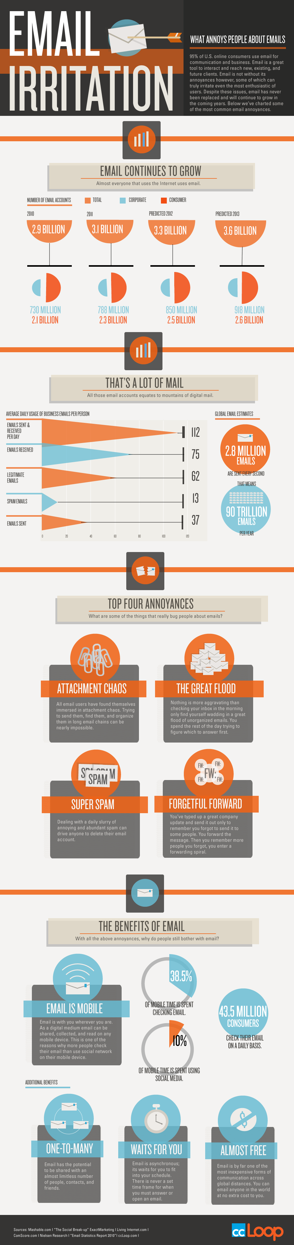
Here is an awesome infographic by ccLoop, the winner of the 2011 AlwaysOn Global 250, focused on the growth of Email, volume of Email in numbers, Top 4 Annoyances and benefits of Email.
Click the image for a full-sized version…
The Environmental Cost of SPAM [Infographic]
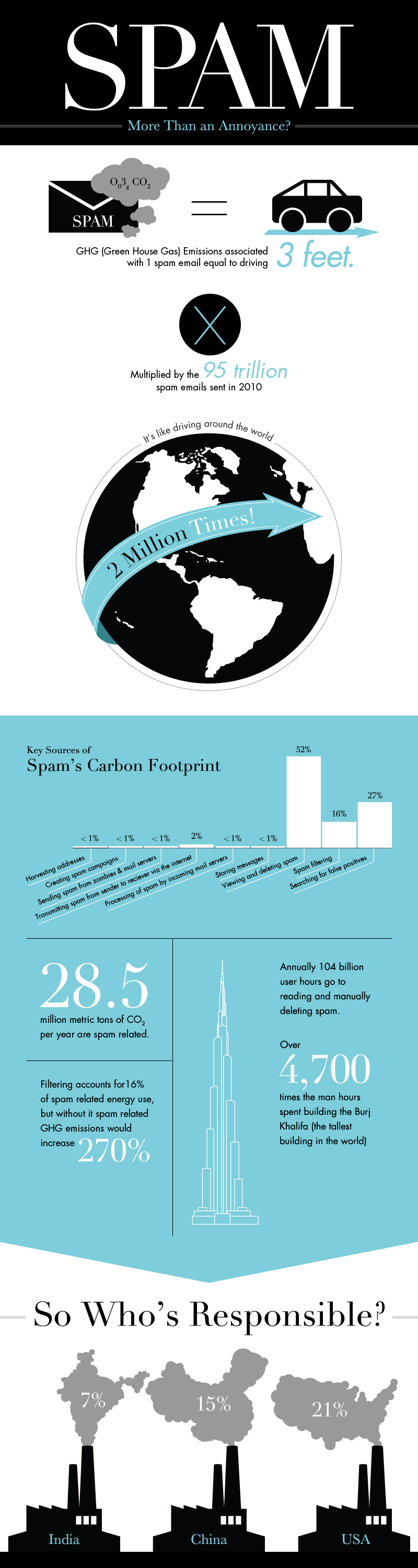
Did you know that SPAM has also a considerable environmental cost?
The folks at WebpageFX have calculated the carbon footprint of the world’s spamming activities and they discovered that “a certain amount of Spam emails is actually the equivalent to the level of Green House Gas (GHG) emissions released from driving 3 feet.”
In particular…
Anatomy of the Perfect Mobile Email

How mobile email should be designed nowadays? Here is an extremely informative infograph that gives ten important guidelines to an amazing mobile experience, plus six things that should be avoided.
Source: Litmus.com…